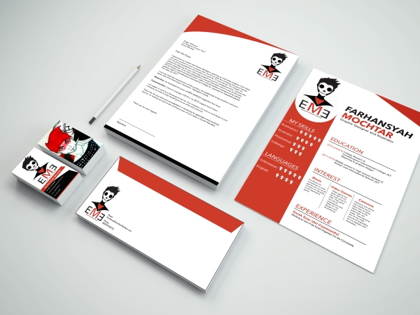
For my professional practice class i was instructed by my professor to brand myself and position myself in the market place. We first instructed to create our own logo and a mini portfolio containing our past artworks. We also create one set of stationery and merchandises based on our own logo.
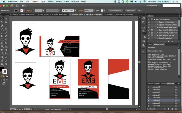
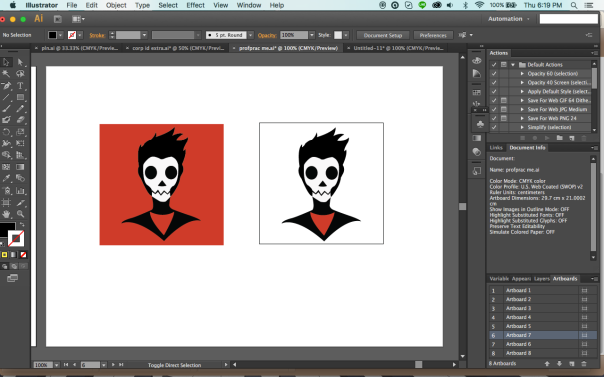
and stationery development process:
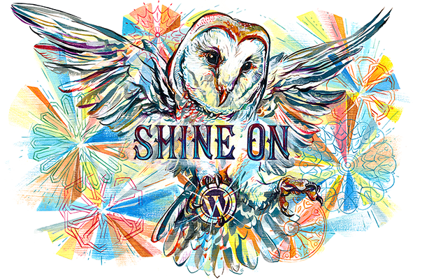
Final Logo:
The Logo is inspired by my love of cartoons, alternative music, and my own edgy nature.
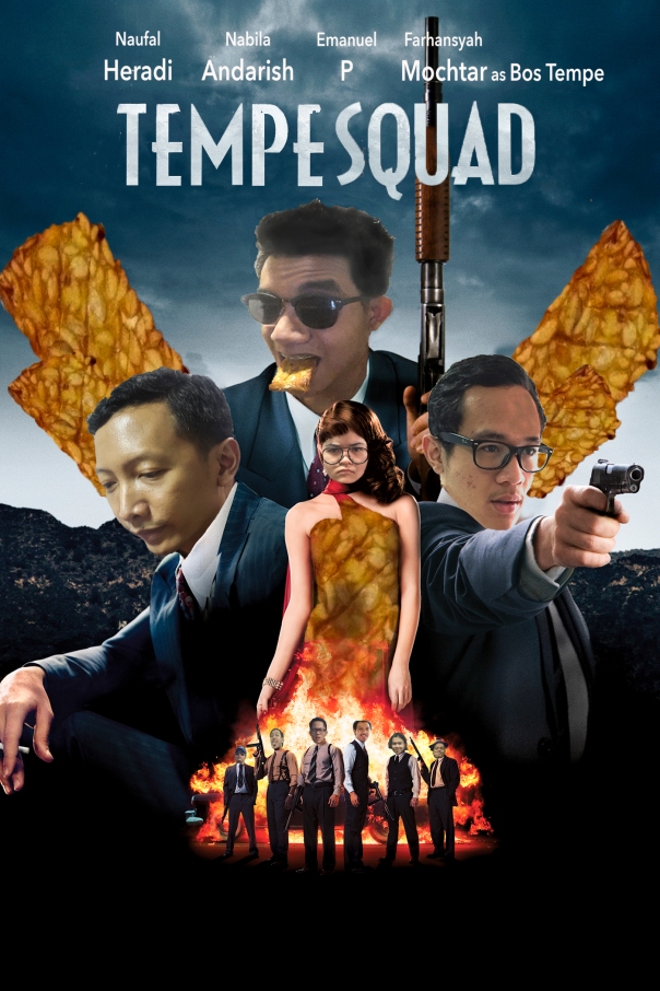
For this project we were tasked to create a parody of one movie poster in the action genre. At this stage i have to use everything i learned in this class to create this movie poster. The movie poster must contain some sort of humours and jokes that can catch the attention of the audience. For this project i have my some friends to participate as a material for this poster parody project. For this project i choose the film “Gangster Squad” starring Ryan gosling, the reason i choose this particular movie is because of the title which i can change it to “Tempe Squad” a running joke among my friends.
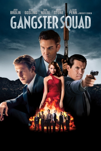
the movie poster that im going to parody
To get to the final result of this poster, there are lots of step that needs to be done from using different tools and technique in photo shop. Here are the steps to achieve on making this poster.:
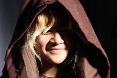
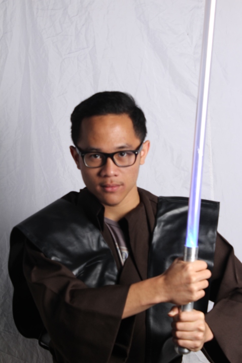
hoFor this assignment my professor set up a trial version of a professional photo shoot which includes experimentation with different types of lighting from diffused to specular lightning and . For this photo shoot me and my classmate were instructed to choose a theme for the photo shoot, me personally choose star wars as my theme.
My friend dressing up as the emperor/ photo taken using diffused light
my friend dressing up as anakin for this photo shoot/Photo taken using specular light
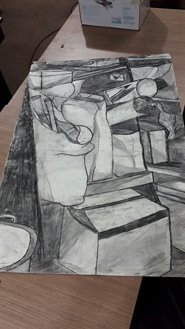
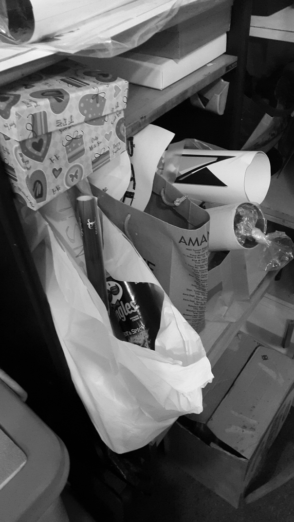
For my drawing class final assignment, my professor instructed me and my classmate to draw a clutter from real life. We were only allowed to draw in an A2 size paper with only using either charcoal or paper collage technique. Me personally choose to do this oroject using charcoal
At first i thought its not gonna be that complicated but when i first started doing it i feel that this project is not as easy as it seems. The A2 size paper makes it hard for me because im used to draw in A4-A5 size paper and also the shapes of the object im drawing is pretty complictaed which make it more difficult. But in the end i finally able to pull it even though i messed up some part of the drawing im still proud of the final result.
Ukiyo-e or better known with its English name “Pictures of the floating world” is a japananese art style flourished during the 17th to the 18th century. The artwork is created using different color of chinese ink and printed on a wood block. Most of the artwork depicts Japanese female wearing traditional clothes and sceneries that are inspired by Japanese agriculture. The art of Ukiyo-E has also inspire modern cultures such as manga and modern comic illustration, famous videogame “okami” is an example of an ukiyo-e inspired game design. When describing the art style of ukiyo-e people describe it as a simple Japanese illustration using bold monochromatic colors according to wikipedia. Ukiyo-e has been describe as an art style that defines Japanese art from foreign perspective.
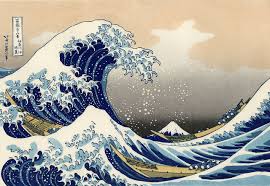
Ukiyo-E has gain international attention thanks to the work of “Hokusai” the artist behind the ukiyo-e artwork “The Great Wave Of Kanagawa” which is very famous due to the style of drawing the waves of the water.
“Great Wave of Kanagawa” Hokusai
How ukiyo-e artwork is made:
There are two types of artist when creating an ukiyo-e artwork, One is the one who carved the woodblock and one who specialize on inking the artwork. Both job can’t be done easily and it takes years to master these techniques. These technique has been passed down from generation to generation until it reaches the present time which ukiyo-e illustration has been applied in modern artwork and commercial.
The Russian Suprematism is the invention of Russian artist Kazimir Malevich, was one of the earliest and most radical developments in abstract art. Its name derived from Malevich’s belief that Suprematist art would be superior to all the art of the past, and that it would lead to the “supremacy of pure feeling or perception in the pictorial arts.” Heavily influenced by avant-garde poets, and an emerging movement in literary criticism, Malevich derived his interest in flouting the rules of language, in defying reason. He believed that there were only delicate links between words or signs and the objects they denote, and from this he saw the possibilities for a totally abstract art.
he Suprematists’ interest in abstraction was fired by a search for the ‘zero degree’ of painting, the point beyond which the medium could not go without ceasing to be art. This encouraged the use of very simple motifs, since they best articulated the shape and flat surface of the canvases on which they were painted. (Ultimately, the square, circle, and cross became the group’s favorite motifs.) It also encouraged many Suprematists to emphasise the surface texture of the paint on canvas, this texture being another essential quality of the medium of painting.
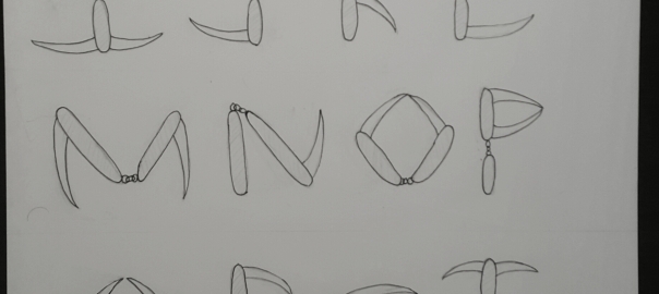
In my Typography class we were tasked to create our own Font/Typeface based on an object that can be collected in our classroom. For five minutes we search the room for object that can be use for the inspiration of the font. After five minute has passed each of us already found the object were gonna use as an inspiration and my object is a Pocket Knife.
Pocket Knife.
After i got my inspirational Object i started doing some brainstorming and doodle them in my sketchbook, I try first to understand the mechanism of the object then tried to utilize to form an alphabet. After some time i managed to come up with sketches of some of alphabets but with this i managed to figure out how to use this object to create an Alphabet from A-Z.
Early Sketches
After im finish with all the sketches i started drawing my typeface in A3 Paper and making sure its presentation ready. Having all the sketches with me makes this part really easy since all i need to do is to follow the sketches in my sketchbook. I start drawing my Typeface with an HB pencil and finishing with a drawing Pen. After i finish with my Typeface i come up with an Idea for the name of my Typeface which is “The SwitchBlade Font”.
After we all present our Typeface to the whole class our mentor gives us a new tasked which is to create a Stop motion video which will be used to promote our own typeface.
I started on doing some sketches of the storyboard for my but the problem in this project is how do i make this stop motion video. the object i had is not that common to find therefore i planned to use papers that shaped to look like the pocket knife, i separate the blade from the body so i can show the audience the mechanism of the blade that inspire my typeface.
The merchandise:
At first i started to do some sketches for the merchandise, then i started to pick three of my merchandise sketches and turn it into a real
merchandise sketches
In the end i pick keychain,pin, and mug:
The final merchandise
i choose this three types of merchandise because its convenient and easy to print.
Typeface poster:
i started creating my posters straight in illustrator. i send my first poster design to my mentor for a quality control, she says that my first poster design is tocomplex and it overpowers the typeface itself. After the qc i started remaking the poster with a more simpler design.
In this week i decided to make a top 10 list of the most inspirational typography artist that ive came across in my research. And here are the list:
Number 10. Christopher wool
Wool is best known for his paintings of large, black, stenciled letters on white canvases. Using a system of alliteration, with the words often broken up by a grid system, or with the vowels removed (as in ‘TRBL’ or ‘DRNK’), Wool’s word paintings often demand reading aloud to make sense.Wool is a New York Based Typographer.
Number 9: Baron Fig
Baron Fig- Oscar Wilde quotes
Number 8: Lex Wilson:
High Low-Lex Wilson
is a Creative from Cambridge, UK, currently living in Nottingham. Specialisms: graphic design, typography, illustration. His well known style is to use perspective and shading in order to create 3 dimensional typography on paper.
Number 7: Sabeena Karnik
May-Sabeena Karnik
Mumbai based designer Sabeena Karnik combines both typography and paper art. Specialising in paper sculpturing and acrylic murals, Karnik loves to work with paper and exploring its ‘endless possibilities’. Creating 3D, calligraphy inspired typography sculptures, Karnik has produced a number of illustrations for magazines across the world.
Number 6: Thuy May Tit
D-Thuy May Tit
Vietnamese student Thuy May Tit loves design – especially when it comes to creative typography. She’s already come up with a whole host of inspirational lettering – including this intricate and incredibly detailed ‘Whispered Garden’ alphabet.
Number 5: Charles William
Now-Charles Williams
Typographer, illustrator and graphic designer,Charles Williams is currently based in London. Represented by Agency Rush, his client list has already included Adobe, Nike and Converse. This typography examples was designed for a corporate document produced by Performics, a Boston-based branding company.
Number 4: Tomaz Biernat
Coffeebook-Tomasz Biernat
Tomasz Biernat specialises in old school lettering – often recreating those custom typefaces that hark back to chalk boards and elaborate calligraphy. His typography has been seen on prints, posters and t-shirts as well as bigger installations.
Number 3: Alex Trochut
Ketchup and Mustard- Alex Trochut
Alex Trochut is a typographer and graphic designer based in Barcelona. He has been working as a freelancer since 2007 and has gained clients such as Pepsi, Wallpaper* and Audi. His experimental style has gained him critical acclaim from across the board and with a philosophy of ‘more is more,’ his array of work is a perfect example of embracing the endless spectrum of font formats.
Number 2: Albert Trulls
typeface-Alber Trulls
Albert Trulls is a graphic designer, illustrator and letterer based in Barcelona. After working in a number of design studios and agencies, Albert is now a freelancer. When designing type, Albert develops the conceptual part first and then tries to come up with a suitable and innovative solution. That way, the concept goes together with the form.
Number 1: Nina Greiger
Send-Nina Greiger
Nina Grreiger is an illustrator and graphic designer hailing from Cracow in Poland. She combines typography with craft and the results are some of the most beautiful fonts we’ve ever come across.
This particular example was an experiment with embroidery on paper, using different shapes and forms. I love it!
In this project i was tasked by my mentor to create a wearable object such as head dress, necklace, and bracelet by using unusual materials. The challenge of this project is that we have to create this wearable object based on one out of three themes which is: Love, Sorrow, and Anger.
For the theme i decided that im gonna pick Love, the reason i pick this theme is because there are lots of things that can be related to it. After i pick the theme i started to do some research on my theme which is “love” and i start to think that love is not only for our soulmate or our family but also for our friends thats when i came up with and idea of creating some sort of a friendship Bracelet. I started to do some sketches of the ideas and form of the wearable that im going to create. I decided that Im gonna use straws as the main component of my Wearable because i love the unique way that straws can be shaped into different wearable object such as Necklace and bracelet and also the unique texture and feels to it.
The Early Doodles
I decided to start making the prototypes for my wearables and so i collected two more types of unusual object which is Sablon String and coloured Paper clip. The reason i pick this two items is because they add more texture to the wearable. Since im planning to make a some kind of friendship bracelet which most of the time is crafted using strings i utilize the sablon string by wrapping it around the straws in order to create something simmilar to a friendship bracelet.
comparison of the Real friendship bracelet and my prototype:
Example of a friendship braceletThe Prototype
After consulting with my mentor about the prototype and the future of my final product I decided that i need to research more about wearables that are crafted using straws because according to my mentor i need to utilize the straws more than i utilize the other minor objects. In the middle of my research i stumble on different examples of wearable that were created using straws and i notice that most of the example utilize the different colour the straws provide and also the way it can be cut and joint together. I decided that i will change my wearable type from a bracelet into a necklace due to the fact i could utilize the straw more when using it to craft a necklace.
After doing more suggestive research i set out to buy coloured straws which is the final component needed in order to create the finish product.
Sketch of the final Product
Creating the final Product:
Materials For The Final Product:1. Black Straws 2. Coloured Straws 3. Sablon String 4. Paper Clips 5. Scissor 6. Korean Glue
After buying all the materials for the wearable started to create the product itself. i begin by creating the body of the necklace which is made by joining four black straws and wrapping them with the Sablon strings which is similar to the way i create my prototype.The next thing i do is creating the triangular form using the colourful straws for the main body and using the black straws for joining all the coloured straws together. After that joint the base of the two triangular forms by using the korean in order to create a new form.
Working of the triangular Form
After finishing the triangular forms its time to joint together the combined Triangular forms with the body of the necklace itself. At first i tried to joint them together by using the sablon strings i have but it turns out it wasn’t strong enough to hold them together, so i go back and use the korean glue to stick them together. it took me around 2 hours to fix and re adjust the product in order to match it with the one in the sketch layout but in the end i manage to pull through.
The Final Result:
The Triangles Of Love And Friendship
Conclusion:
At the end of the project i realize that if i have better planning and sense of direction at the start i can achieve better result in this project but however im very proud on what i have learn and achieve in this project.


 The Final Result