Category Archives: Academic English

“Show Your Work” The book review in general

‘Show Your Work’ is a book filled with a lot of useful information for creative people to show and publicise their work. The key is to search the pages as you read for the little nuggets of information is there but not always so obvious. Some of the information jumps out at you like the title of Chapter 1, “You Don’t Have to be a Genius,” which helps you to understand that creativity is best served as a process with other people. Kleon says to get the juices flowing join a Writing group, take a drawing. Do whatever it takes to be creative with other people.

The main point to the whole book is in order to get noticed an artist or writer you must be willing to go the extra mile to insure your work is the best you can produce, then seek out every opportunity to get work gets noticed. This means doing whatever it takes, starting a blog, teaching a class joining a group, shouting from the rooftop, whatever.

While the only drawback is the book is not an in depth guide to writing or the marketing your work it is a worthwhile addition to any creative types bookshelf.
Book review “A Century of posters”

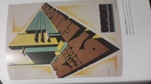
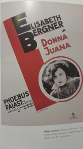
This book written by Alston W Purvis features the collection of 80s-90s posters from commercial, advertising, campaign and so on. the posters in this book have a really good designs especially in the vintage side. This book shows me that during that time posters were made with  less vibrant color and focuses more on darker and rusty colors. this book also shows the famous poster artists from the early 80’s till 90’s

In conclusion this book is highly recommended

example 1
example of poster inside the book
example 2
example 2

Japanese Book Binding

Last month my comping class mentor taught me how to create our own Japanese book binding.

At first when my mentor showed us the process i tough its gonna be complicated but when tried it myself it feels really simple and easy to memorise, the only intricate part of this book binding process is the consistency and neatness when doing the cutting and punch holing the paper. But Overall its a very simple process.

After the class session my mentor tasked us to create 3 Japanese book binding using three different sizes of paper ranging from A4-A6. For the cover of my Book i use carton paper wrapped with gift wrapping paper in order to create a unique texture and for the actual body of the book i uses normal white paper.

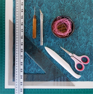
Materials Needed

The Materials Needed
  • Scissors
  • Bone Folder
  • Three sheets of 18in x 24in (approx 46cm x 61cm) Drawing Paper or sketchbook paper
  • Sheet of thick handmade paper or card stock
  • Waxed linen thread
  • Bookbinding Needle
  • Awl
  • Ruler
  • Triangle (or set square)
  • Cutter

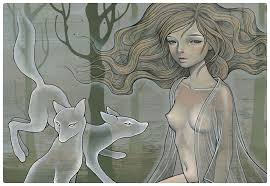
The Art Of Wood Panel Illustration “Audrey Kawasaki”

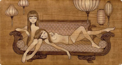
Audrey Kawasaki is a Illustrator and painter based in Los-Angeles, she specialised on wood panel illustration of erotic young female adult using ink and oil paint. Her style has been described as a fusion of Surrealism and manga her primary influences came from artist such as Gustav Klimt and Alphonse Mucha. For me her method of wood panel illustration is very inspiring due to the fact that her color scheme and style of art matches perfectly with the earthy color and texture of the wood panel.

Lost in a mirror-Audrey Kawasaki
Restlessly-Audrey Kawasaki

Brief History:

Audrey Kawasaki studied Fine Art painting for two years in Pratt Institute in New York city. After two years She dropped out of the institution without even completing her degree. This is due to the fact that her professors has commented on her particular style of drawing nude pictures of adolescent women. Her art style has gathered lots of audience in the art scene in both New York and Los Angeles.In 2005, Kawasaki designed the cover art for Alice Smith’s For Lovers, Dreamers & Me. In 2011, singer Christina Perri was tattooed with Kawasaki’s painting, “My Dishonest Heart”, by Kat Von D on an episode of LA Ink. Kawasaki has also been featured in several art magazines including Hi-Fructose and Juxtapoz, and has started developing more commercial products such as phone skins and mint boxes.

Featured Artitst 1: Rian Hughes

Intro:

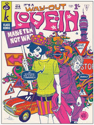
Rian Hughes is a British Graphic Designer, illustrator, Typographer, and comic artist, noted for his work on 200AD, where he illustrated Robo-Hunter, Tales from Beyond Science, among others. His work was highly distinctive, wearing its design influences on its sleeve, daring to be two-dimensional and bold and in its use of large expanses of bold colours. This particular style is really famous during the 1990’s, when british and american comic are leaning towards full coloured illustration.

Tales beyond science-Rian Hughes

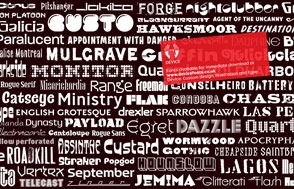
After quitting making comic illustration Rian started to create his own fonts and typeface for his own purpose, which led to the birth of his well-known design studio named “Device”. Device has done design works for major companies such as DC Comic and Virgin Airways.

Art Style: 

Hughes’ discovery of the Mac in 1993 pushed his illustration work in a more stylised graphic direction. Adopting first Freehand than Adobe Illustrator, he used a wide variety of flat colour and texture in asymmetric and dynamic layouts, his characters became more elegant and exaggerated, and the type, generally custom designed for each illustration, became an integral part of his imagemaking process. This very influential flat vector style has been dubbed “Sans Ligne” school by artist Will Kane.

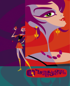
Hughes illustration work includes title sequences for The Box, poster designs for Tokyo fashion company Jun Co.’s Yellow Boots chain, the animated on-board safety film for Virgin Airlines, Eurostar’s poster campaign, a collection of Hawaiian shirts, a range for Swatch and the BBC’s CD edition of Philip Pullman’s His Dark Materials trilogy. In 2007 he collaborated with ex-Spice Girl Geri Halliwell on a series of six children’s books, Ugenia Lavender.

Now widely copied, the influence of Hughes’ illustration style can be seen in advertising, on covers for mass-market women’s paperbacks, children’s books and editorial illustrations worldwide.

Example of Rian Hughes Artwork:

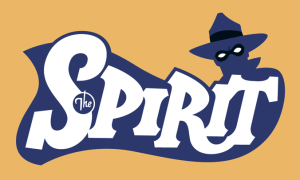
The Spirit Logo-Rian Hughes
AIGA_Hughes_fonts
Fonts/Typeface created by Rian Hughes
Tea N Biscuit-Rian Hughes
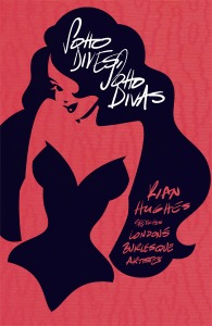
Soho Divas-Rian Hughes
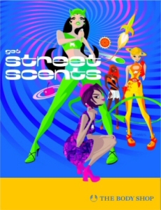
Street Scents-Rian Hughes

Andrew Gorkovenko (boxed pasta)

in this picture there’s a boxed pasta called Pasta la vista with a unique design. This design is created by Andrew Gorkovenko an advertising designer who specializes in branding and is based in Moscow, he mainly works on corporate and product identity development.the design in this product very remarkably done from the shape of the box to the choice of colors that honors the origin of the pasta which is Italy. The design is looks simple but its very appealing to the eyes which is the target of all designer when they work at any creative fields.

“A Royalty-Free” illustration that exceeds your expectation

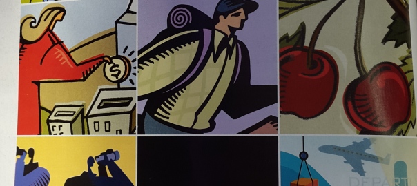
The artwork in this picture shows a simple illustration about how our daily activities and economic works. The reason i choose this artwork to be discussed is because i think this artwork is very interesting from the way the illustration is drawn and the meaning behind the artwork itself. The true meaning of this artwork is how there are daily expectation for our labours and contribution to the society and this artwork proves that there’s a process when fulfilling this expectation. So in the end for me this artwork means that there a is a cycle and process in our economy and if we follow this process we can get something good in return.